Scene Building With Plots#
One can distingish between two kinds of plots:
Quantitative scientific plots with numbers and dimensions to describe data (e.g. made with matplotlib).
Qualitative explanatory plots that convey a message in the clearest way possible (e.g. made with manim)
In this tutorial, I will take you on a journey from choosing a topic to making a scientific plot to then transforming it into an explanatory plot with manim:
Formulating a Quantitative Concept#
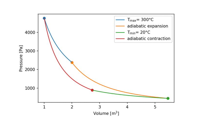
In order to see how this works, the only think we need to know is that the Carnot Cycle obeys these formulas:
$pV = RT $ ideal gas equation
$pV = const $ upper and lower curve (also called “isotherm”)
$pV^k = const $ with $ k = 5/3$ for the left and right curve (also called “adiabatic”)
[1]:
import numpy as np
import matplotlib.pyplot as plt
from scipy.constants import zero_Celsius
plt.rcParams['figure.dpi'] = 150

Tmax = zero_Celsius +300
Tmin = zero_Celsius +20
R = 8.314
kappa = 5/3
V1= 1
V2= 2
Matplotlib is building the font cache; this may take a moment.
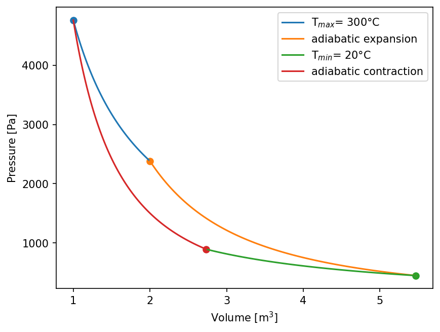
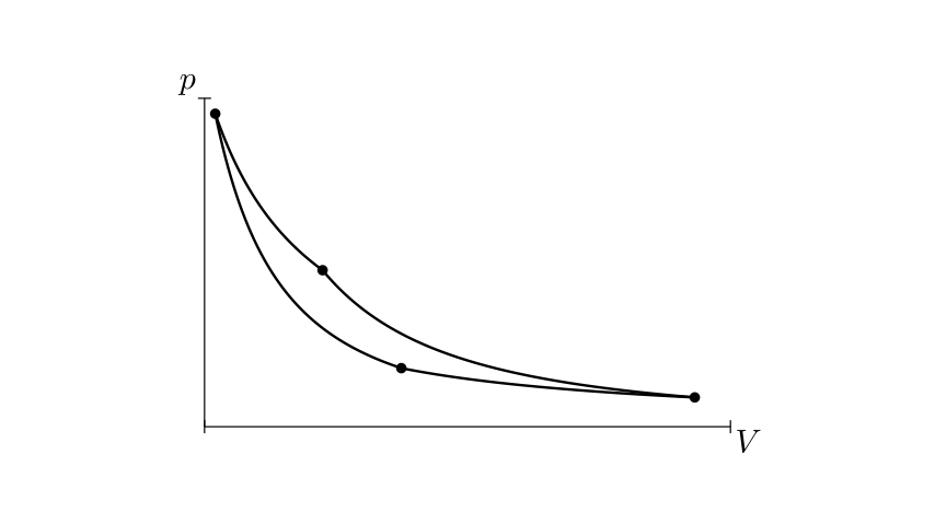
Now, let’s have a look on the plot via matplotlib. As of now, implementing and debugging formulas is important, design is not.
[2]:
p1 = R*Tmax/V1 # ideal gas equation
p2 = p1*V1/V2

V3 = (Tmax/Tmin * V2**(kappa-1))**(1/(kappa-1))
p3 = p2* V2**kappa / V3**kappa

V4 = (Tmax/Tmin * V1**(kappa-1))**(1/(kappa-1))
p4 = p3*V3/V4

V12 = np.linspace(V1,V2,100)
V23 = np.linspace(V2,V3,100)
V34 = np.linspace(V3,V4,100)
V41 = np.linspace(V4,V1,100)

def p_isotherm(V,T):
    return (R*T)/V

def p_adiabatisch(V,p_start,v_start):
    return (p_start*v_start**kappa)/V**kappa

plt.plot(V12, p_isotherm(V12,Tmax),label = "T$_{max}$" +f"= {Tmax-zero_Celsius:.0f}°C")
plt.plot(V23, p_adiabatisch(V23, p2,V2),label = f"adiabatic expansion")
plt.plot(V34, p_isotherm(V34,Tmin),label = "T$_{min}$" +f"= {Tmin-zero_Celsius:.0f}°C")
plt.plot(V41, p_adiabatisch(V41, p4,V4),label = f"adiabatic contraction")

plt.legend()
plt.scatter(V1,p1)
plt.scatter(V2,p2)
plt.scatter(V3,p3)
plt.scatter(V4,p4)

plt.ylabel("Pressure [Pa]")
plt.xlabel("Volume [m$^3$]")
plt.ticklabel_format(axis="x", style="sci", scilimits=(0,5))
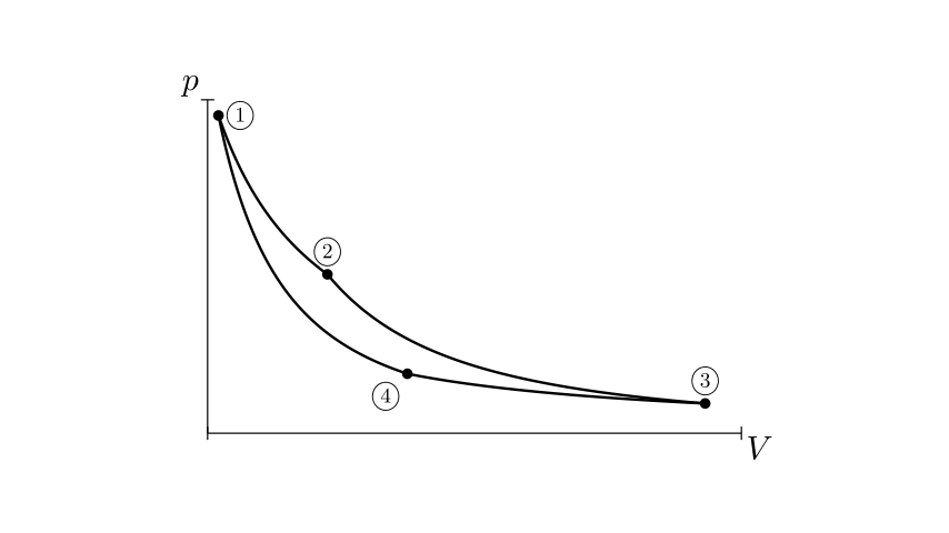
Extending to The Qualitiative Concept#
Now we have a good basis to convert this idea into a visually appealing and explanatory graph that will make it easy for everyone to understand complex problems.
[3]:
from manim import *
config.media_embed = True
param   = "-v WARNING -s -ql --disable_caching --progress_bar None Example"
Manim Community v0.17.3
[4]:
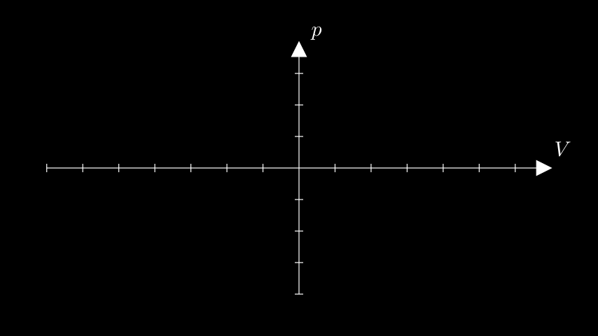
%%manim $param
class Example(Scene):
    def construct(self):
        my_ax = Axes()
        labels = my_ax.get_axis_labels(x_label="V", y_label="p")
        self.add(my_ax,labels)
[5]:
# making some styling here
Axes.set_default(axis_config={"color": BLACK}, tips= False)
MathTex.set_default(color = BLACK)
config.background_color = WHITE
[6]:
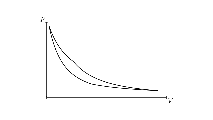
%%manim $param
ax = Axes(x_range=[0.9, 5.8, 4.9], y_range=[0, 5000, 5000],x_length=8, y_length=5,stroke_color=BLACK)
labels = ax.get_axis_labels(x_label="V", y_label="p")
labels[0].shift(.6*DOWN)
labels[1].shift(.6*LEFT)
isotherm12_graph = ax.plot(
    lambda x: p_isotherm(x, Tmax), x_range=[V1, V2,0.01], color=BLACK
)
adiabatisch23_graph = ax.plot(
    lambda x: p_adiabatisch(x, p2, V2) , x_range=[V2, V3,0.01], color=BLACK
)
isotherm34_graph = ax.plot(
    lambda x: p_isotherm(x, Tmin), x_range=[V3, V4,-0.01], color=BLACK
)
adiabatisch41_graph = ax.plot(
    lambda x: p_adiabatisch(x, p4, V4), x_range=[V4, V1,-0.01], color=BLACK
)
lines = VGroup(
    isotherm12_graph, adiabatisch23_graph, isotherm34_graph, adiabatisch41_graph
)

ax.add(labels)

class Example(Scene):
    def construct(self):
        self.add(ax,lines)
[7]:
%%manim $param

Dot.set_default(color=BLACK)
dots = VGroup()
dots += Dot().move_to(isotherm12_graph.get_start())
dots += Dot().move_to(isotherm12_graph.get_end())
dots += Dot().move_to(isotherm34_graph.get_start())
dots += Dot().move_to(isotherm34_graph.get_end())

class Example(Scene):
    def construct(self):
        self.add(ax,lines,dots)
[8]:
%%manim $param

nums= VGroup()
nums+= MathTex(r"{\large \textcircled{\small 1}} ").scale(0.7).next_to(dots[0],RIGHT,buff=0.4*SMALL_BUFF)
nums+= MathTex(r"{\large \textcircled{\small 2}} ").scale(0.7).next_to(dots[1],UP, buff=0.4 * SMALL_BUFF)
nums+= MathTex(r"{\large \textcircled{\small 3}} ").scale(0.7).next_to(dots[2],UP,buff=0.4*SMALL_BUFF)
nums+= MathTex(r"{\large \textcircled{\small 4}} ").scale(0.7).next_to(dots[3],DL ,buff=0.4*SMALL_BUFF)

class Example(Scene):
    def construct(self):
        self.add(ax,lines, dots,nums)
[9]:
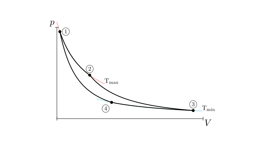
%%manim $param

background_strokes = VGroup()
background_strokes += ax.plot(lambda x: p_isotherm(x, Tmax),x_range=[V1 - 0.1, V2 + 0.5, 0.01], color=RED, stroke_opacity=0.5)
background_strokes += ax.plot(lambda x: p_isotherm(x, Tmin), x_range=[V3 + 0.3,V4 - 0.5,-0.01], color=BLUE, stroke_opacity=0.5)
background_strokes.set_z_index(-1);
label = VGroup()
label += MathTex(r"\text{T}_{\text{min}}").scale(0.7).next_to(background_strokes[1],RIGHT,aligned_edge=DOWN, buff=0)
label += MathTex(r"\text{T}_{\text{max}}").scale(0.7).next_to(background_strokes[0],RIGHT,aligned_edge=DOWN, buff=0)
background_strokes += label

class Example(Scene):
    def construct(self):
        self.add(ax,lines, dots,nums,background_strokes)
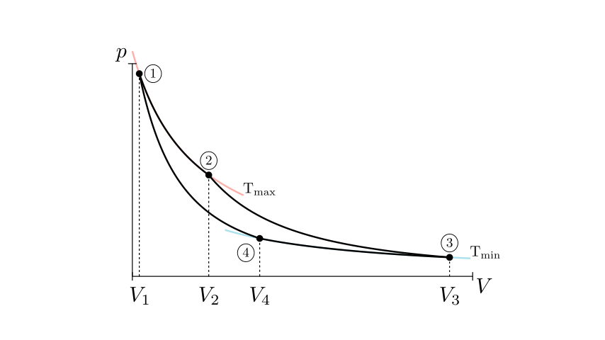
[10]:
%%manim $param

downstrokes = VGroup()
downstrokes += ax.get_vertical_line(ax.i2gp(V1, isotherm12_graph), color=BLACK).set_z_index(-2)
downstrokes += ax.get_vertical_line(ax.i2gp(V2, isotherm12_graph), color=BLACK).set_z_index(-2)
downstrokes += ax.get_vertical_line(ax.i2gp(V3, isotherm34_graph), color=BLACK).set_z_index(-2)
downstrokes += ax.get_vertical_line(ax.i2gp(V4, isotherm34_graph), color=BLACK).set_z_index(-2)
down_labels= VGroup()
down_labels += MathTex("{ V }_{ 1 }").next_to(downstrokes[0], DOWN)
down_labels += MathTex("{ V }_{ 2 }").next_to(downstrokes[1], DOWN)
down_labels += MathTex("{ V }_{ 3 }").next_to(downstrokes[2], DOWN)
down_labels += MathTex("{ V }_{ 4 }").next_to(downstrokes[3], DOWN)

class Example(Scene):
    def construct(self):
        self.add(ax,lines, dots,nums,background_strokes, downstrokes,down_labels)
[11]:
%%manim $param
heat_annotation = VGroup()
deltaW = MathTex(r"\Delta W").next_to(dots[3], UL).scale(0.65).shift(0.15 * UP)
bg = deltaW.add_background_rectangle(color=WHITE)
heat_annotation += deltaW
point = isotherm12_graph.point_from_proportion(0.5)
arrow = Arrow(point + UR * 0.5, point, buff=0).set_color(BLACK)
deltaQa = MathTex(r"\Delta Q_a").scale(0.7).next_to(arrow, UR, buff=0)
heat_annotation += arrow
heat_annotation += deltaQa
point = isotherm34_graph.point_from_proportion(0.4)
arrow = Arrow(point, point + DL * 0.5, buff=0).set_color(BLACK)
deltaQb = MathTex(r"\Delta Q_b").scale(0.7).next_to(arrow, LEFT, buff=0.1).shift(0.1 * DOWN)
heat_annotation += arrow
heat_annotation += deltaQb
class Example(Scene):
def construct(self):
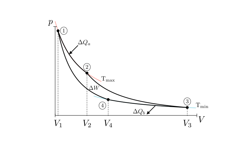
self.add(ax,lines, dots,nums,background_strokes, downstrokes,down_labels,heat_annotation)
[12]:
%%manim $param
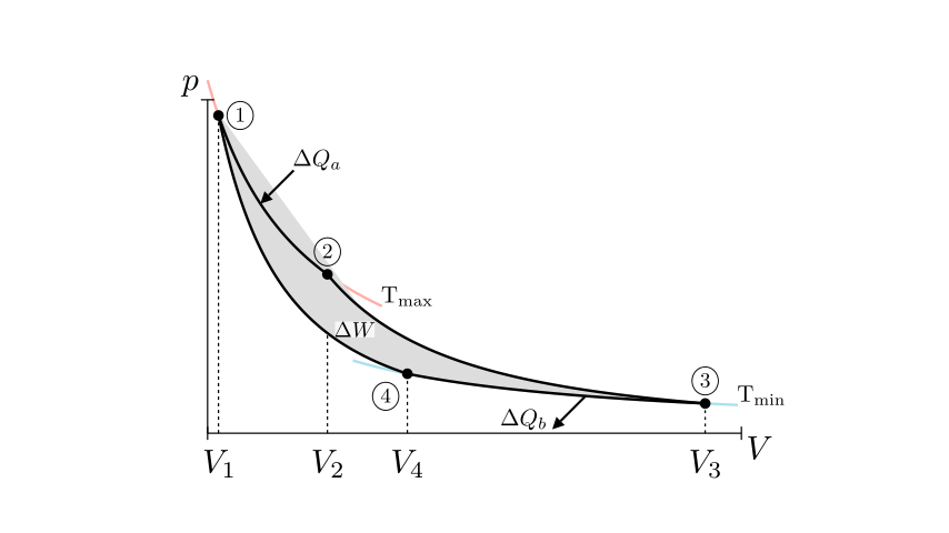
c1 = Cutout(lines[0].copy().reverse_points(),lines[3]).set_opacity(1).set_color(GREEN)
c2 = Cutout(lines[1],lines[2])
bg_grey = Union(c1,c2, color=GREY_A).set_opacity(1)
bg_grey.z_index=-1
class Example(Scene):
def construct(self):
#self.add(c1,c2)
self.add(ax,lines, dots,nums,background_strokes)
self.add(downstrokes,down_labels,heat_annotation,bg_grey)
[13]:
carnot_graph= VGroup(ax,lines, dots,nums,background_strokes,downstrokes,down_labels,heat_annotation,bg_grey)
And here is the final plot:
[14]:
%%manim $param

sourunding_dot = Dot().scale(1.3).set_fill(color=BLACK).set_z_index(-1)
innerdot = Dot().set_color(WHITE).scale(1)
moving_dot = VGroup(sourunding_dot, innerdot)
moving_dot.move_to(isotherm12_graph.point_from_proportion(0.3))

class Example(Scene):
    def construct(self):
        self.add(carnot_graph)
        self.add(moving_dot)

Outlook#
[15]:
from IPython.display import YouTubeVideo
YouTubeVideo('_8RkZaiXP0E', width=800, height=600)
[15]:
[ ]: